It’s science or art. Everything was nice. They are ingredients used to understand color. Learning how to effectively use color is an absolute must for any photographer, whether you are looking to improve the works displayed on your photography website or trying to start your career.
One of the most important aspects of photography is color. Composition, visual appeal, and the viewer are all affected by it. To help you understand color in photography and learn how to use it effectively, we put together a simple guide.
The Birth of Color photography
Photography was a black-and-white medium for almost a century after it was invented. The process of photography was expensive and fragile. A lot of money and time was requires to practice. Improvements in the optical, chemical, and practical aspects of photography were the focus of the advancement of photographic technology in that early period. Many wanted to make photography more suitable for portraiture. The photographic technology had to be stable, portable, and affordable.
When was color photography invented?
The first color photograph was created in the year 1861. The perception of all colors in an image could be created with a several-step process of taking multiple images through three colored glass plates, invented by physicist James Clerk Maxwell. View of Agen is a famous colored landscape photo of southern France that was created in 1877 by Louis Du Houron.
Another long-exposure color photography technique was created by Auguste and Louis Lumire at the start of the 1900s, called Autochrome Lumire. The plate methods yielded less than desirable results. Gabriel Lippmann won the Nobel Prize in physics in 1908 for his method of creating color in a photos in just one process using a color-sensitive film coating.
From time consuming to Time Magazine.
The most widely adopted type of color film, which also used light-sensitive emulsion, was eventually replaced by Lippman’s chemical emulsion. The style of “tripack” color film was invented in 1935 by two Leopolds, Leopold Mannes and Leopold Godowsky, and it was popularized by companies like Kodak and Polaroid. It took a few more decades for color photography to catch on, despite the fact that stores began stocking Kodak’s Kodachrome color film. Photographers like William Eggleston gained recognition in the 1970s through gallery exhibits and famous publications. Until then, people knew color as more of a party trick.
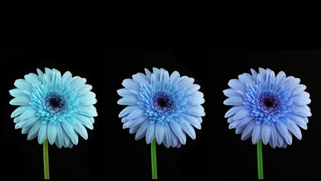
Color in Photography
When light is reflected off an object, the definition of color is separated. Light starts the color. The color we see is influence by characteristics of the source. The length of reflected light determines the color we see.
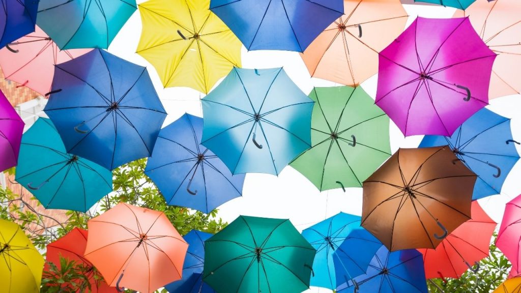
A white light has a combination of all wavelengths of light. We perceive different colors as different combinations of wavelengths. When we look at the Sun, we are seeing a white light. However, the Sun has no color, since it reflects all wavelengths of light equally. The Sun appears white because it is reflecting so many wavelengths of light that we do not notice any difference in color. If we look at the Moon, we see a black light. The Moon has no color because it reflects only certain wavelengths of light. In this case, the Moon appears black because it is reflecting mostly red and blue wavelengths of light. Our eyes also can detect color.
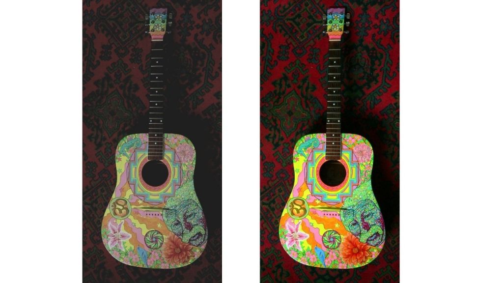
It’s said that color is three-dimensional because of it’s unique aspects. There are three properties to consider when defining a color; hue, value, and Saturation.
- Hue : Red, yellow, green, orange, and so on are some of the colors we give the name hue. It’s the definition of a color perception. Some colors, like yellow, are light so they have a natural value. The other colors are not as dark. All colors can be in any values. Adding white paint can make a tint. Adding black paint will make it more dark.
- Value: Value is the ultimate shade of subtractive color. Also, you can call it the dark and light properties of any color.
- Saturation: Saturation is the level of grayness. The more saturated the color becomes.
Color Photography and Composition
A photographer can use color to create a mood in their photos. How you combine various colors affects how people feel when they look at your photographs. Understanding color in photography is vital.

The focal point of the photograph, as well as how viewers feel about it, can be influenced by how you frame a scene. It is better to place red and green objects next to each other than it is to place blue and green elements next to each other. The best way to train your eye is to use color.
We can take color for granted because we see it all around. It’s important to use color well in your images. As you take photos, look at the colors in the frame. Would your image look better if you removed something from it. Adding color to your picture would make it more interesting.
There are tips for using colors well in your photographs
How are the colors in your images related? You can make use of both colors. These are not on the color wheel. There’s red and green. Both are blue and orange. There is yellow and purple.
Think of primary and secondary colors. You can also use color to enhance your photos. Do you like the colors of contrast? These are the same colors. Would you prefer more harmonious colors for your subject? They are next to each other on the color wheel.
Warm colors help create moods in your pictures. So, it is dependent on how you use color. If you have a bright yellow sky, it will make you feel summery.
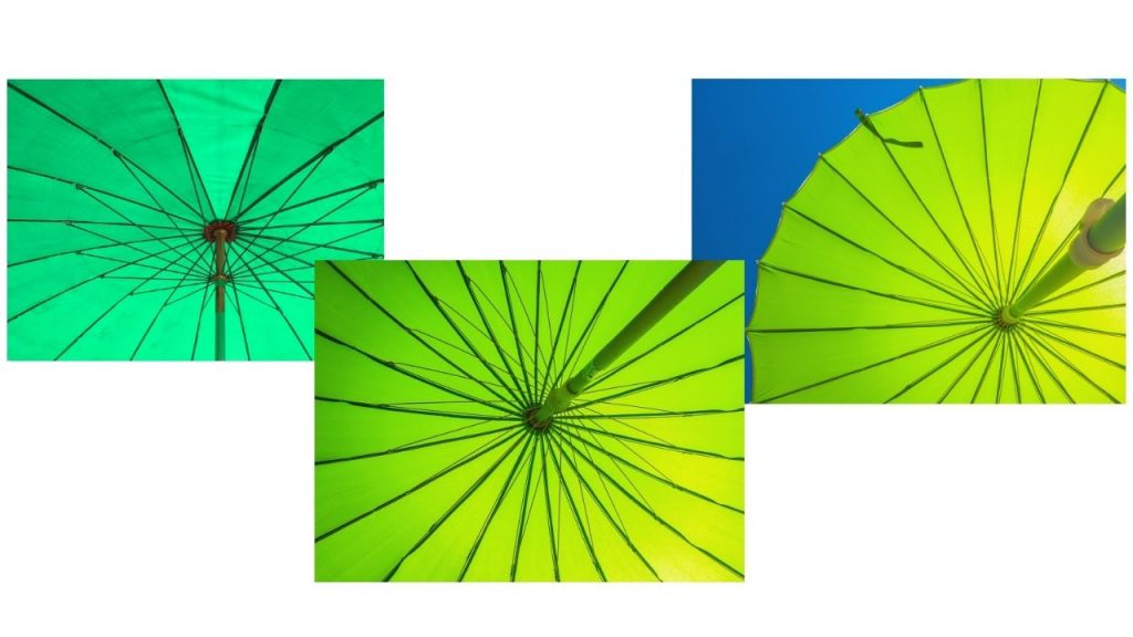
A green parasol creates a different feeling.

A blue parasol makes a photo with an atmosphere.
Use One Dominant Color
Some photographers use one hue that is dominant in a photo. A red car is in a green and brown forest scene. The softer colors of nature are dominate by them.

One color can be make dominant by contrast between bright and dark colors. One may stand out more than others in a scene with saturation levels of colors. So, make a single color stand out in your photos by managing this well.
Color Photography Today
Today, of course, there is no debate about the legitimacy of making art in color.
Digital photography had technical hurdles that stopped wider adoption. As with color photography, there were new opportunities for photographers and publishers. Digital photography has advanced color photos.
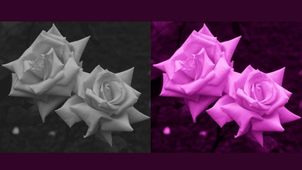
For the majority of people, black-and-white was the default color, and color was an aesthetic choice. But that changed with digital. Black-and-white digital images are shot in color first, meaning that it’s color by default, and black-and-white by choice.
Digital photography made it easier to work in color by eliminating the need to use multiple color films for each lighting situation. You can set the white balance in the camera. The result is that color photography is now more easy and popular. And people also use it very widely. In fact, you can call it a universal human culture.
Post-processing color photography
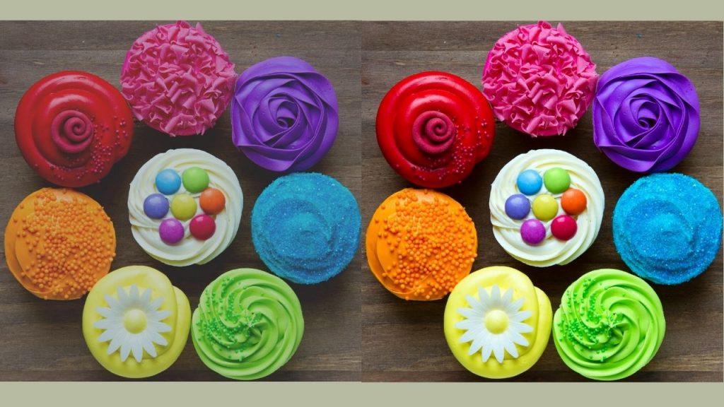
Color correction is a very important step in post-processing. Clipping Amazon is an expert in providing photo editing. We offer service while maintaining high quality. As of right now, We are working with businesses like online shops and photography businesses. Moreover, it’s a guarantee that will be of high quality, be at the lowest price, and be delivered quickly. Even with a lot of images to make, we have a team of dedicated graphics designers who work around the clock. So, make sure that the photo color correction service you choose is the best for your product, personal, model, and fashion portraits. We are a well-known photo editing company offering the lowest price for all categories of services. Our best editor also works hard to make your images look great. So, Don’t be late; Get a free quote now, and take our free trial to check our Photo Editing quality.
